Friday, 27 September 2013

Research and Planning; masthead practice


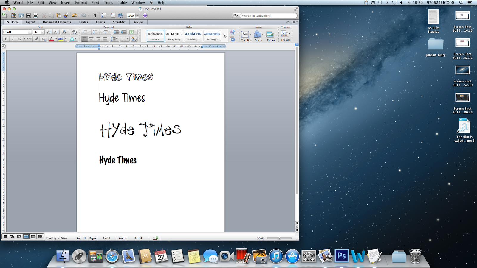
When choosing my font for my magazine, I went on the website dafont to help me choose a unique, eye catching font which will appeal to the teenagers in college.

I experimented with them by putting my favourites onto a word document and seeing which one looks best. 


Thursday, 26 September 2013

Research and Planning; original College magazine image

This is the original version on my mid shot for my college magazine cover. Im going to photoshop this image to get rid of the background so that he will be the main focus of the front cover without a background which s very distracting.

To do list

- original college magazine image
-masthead practice
-updates on magazine

Wednesday, 25 September 2013

Research and Planning; edited mid shot for college magazine

This is my edited version on my mid shot image of Alex for my college magazine. I need to yet add a background so that it will look more eye catching and blend into my background

Research and Planning; College magazine draft


Here is an image of what I'm hoping my college magazine will look like, it had a mid shot of Alex quite large on the left hand side of the page, with a masthead in large, bold blue text saying hyde times, with the college logo on the top right hand corner.
The sections on the sides will be;
-competitions 
-top 5 must haves for college
-pupil of the week 
-interviews with Andy the media teacher a

Friday, 20 September 2013

research and Planning; Slutty Cheryl cole and Magazine Cheryl cole


  In Image 1 Cheryl is wearing light pink clothing. The Top has lace on to show how feminine she is and the jacket has loads of gems and sparkles on to show the glamor. Therefore the audience would be women who are into glamour and fashion. Whereas in Image 2 Cheryl is in black leather top which is quite seductive.
In image 1 she has a blank facial expression but still looks innocent at the same time and innocent.
then in image 2 she has her tongue out licking a metal object seductively
In Image 1 her hair is done very casual yet look like she's going to go out and her make up is simple yet looks like it  has a lot of effort. In Image 2 she has very heavy black eye make up which has been smudged and bright red lipstick on which is a very seductive colour.
Image 2 is very seductive as there is water over her which is making her makeup run and while she's licking the metal object which could arouse certain members of the readers.
In image one she has both her hands her head holding parts of her hair up which makes her look even more innocent. then in image 2 her hand is up to her mouth holding the object.
Wednesday, 11 September 2013

Research and Planning; Front cover analysis


The masthead of the magazine is called 'company' and its done in Big bold text to draw attention to the magazine, also as its in pink it would attract girly girls who are into fashion. The main image is of a fashionable girl dressed for summer. there are a variety of slogans  such as ' make up and party' which will be for girls who want a new look for when the go out instead of the same boring loo, also the other texts have a summer theme, feminine approach  to stand out on the cream background/the girl so it will attract girls with to the magazine because of the style f the magazine suits their fashion sense.
Also each section of an article is done in a different front to demonstrate the variety if information inside which could be to highlight and attract different girls to the magazine,as it  goes from make up tutorials in 'party invitation ' style to making money is a bold plain serious text.However, there is 'Ibiza' across the bottom on the magazine is a light pink colour, to show the how big of a vacation it would be and maybe symbolise the drinks they would get.