Hello,
I hope you enjoy looking through my research and planning on my blog and my final music magazine.
My research and planning starts on 5th march 2014.
From Jordan x
Sunday, 27 April 2014
Saturday, 26 April 2014

Wednesday, 23 April 2014

Monday, 21 April 2014

draft magazine and final piece for my music magazine


On the right is my final magazine and on the left is what I thought I was going to produce when constructing ideas on my music magazine. when thinking of ideas I didn't take into consideration that my magazine would be hard to put together and when looking at other magazines lay outs how formal they are and have has to re design my magazine. however, I think that my magazine looks better than what I planned for as its fits my genre whereas the plan doesn't.
Sunday, 20 April 2014


Final amendments: making contents page


Saturday, 19 April 2014


Final amendments: drafts, remaking the magazine
Front cover draft idea, I've chosen to put a male on the front to help attract my female audience along side the bright bold colours. The layout will make it easier to read and more bold. This should improve my magazine and help attract a bigger audience than my previous magazine.
Final amendments: new magazine images

This is my front cover, I will be cutting him out and putting him onto the 'zig zag' background, then put a black outline onto it so that it looks bold and stands out.


This image will also be on my contents page as the 'luxury item' for him to win.
This is my double page spread image, It will be cutting him out and putting him onto the 'zig zag' background, then put a black outline onto it so that it looks bold and stands out.
Friday, 18 April 2014
Thursday, 17 April 2014


Evaluation Question 5 plan
*use of colour
pink, blue and white
mixed audience mainly female
stand out- eye catching
*images
talk about the images and the representations of them
*design
layout
texts
colours
images
Evaluation Question 4
who would be the audience for your music magazine? why?
 My target audience is teenaged girls between the ages of 14-17, I think my magazine will appeal to this niche audience as it's a pop magazine in which boy bands are now rising meaning more teen girls like the genre pop.
I think my target audience would wear fashionable clothes from high street brands such as topshop, river island and primark as they sell clothes that copy the type that certain celebrities wear. I think my audience would listen to mainly pop music like one direction, puss
y cat dolls, james blunt, mcfly.
they would possible watch a variety of tv shows, e.g. towie
My target audience is teenaged girls between the ages of 14-17, I think my magazine will appeal to this niche audience as it's a pop magazine in which boy bands are now rising meaning more teen girls like the genre pop.I think my target audience would wear fashionable clothes from high street brands such as topshop, river island and primark as they sell clothes that copy the type that certain celebrities wear. I think my audience would listen to mainly pop music like one direction, puss
y cat dolls, james blunt, mcfly.
they would possible watch a variety of tv shows, e.g. towie


Evaluation Question 2
How does your media magazine represent particular social groups?

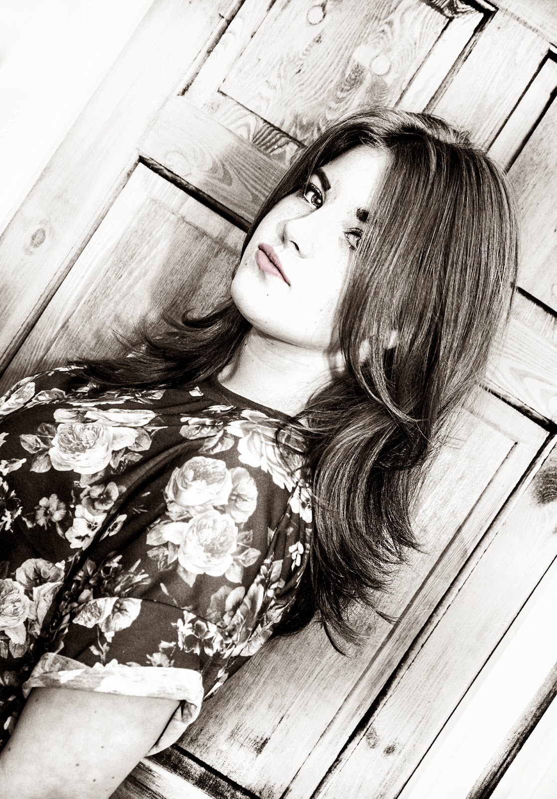
on the left is the image off the contents page of my magazine and on the right is an image of selena gomez photo shoot for a pop magazine, both of these images show certain similarities which would attract the same social group. here are some of the similarities;
both have natural looking make up which will appeal to my target audience as they are begining to wear make up and is teaching them that wearing doesn't make you look more like a celebrity. Even though the image on the right has wavy/curly hair, the images both have the same style of hair with the middle parting with brown hair and both look easy to do so that they don't need to put lots of effort in to do, if the audience want to copy the hair style. The images have serious faces and aren't really posing like pouting. The two images are wearing fashionable clothing which are found on high street shops that represent a pop genre, however, the image on the left is more noticeable than the one on the right due to the sot type being a medium shot, which is the right shot as you focus on their face and top more than the surroundings and position. They are both stood straight with their heads over their shoulders which fits the genre. The lighting in my image is very high key and bright which is natural and fits with the pop genre of my magazine but I had to use lights to get the lighting whereas in the other image the lighting looks very natural. therefor, My image is more suitable for my music magazine as it represents pop music better than the second image which represents pop but isnt very clear
Evaluation Question 1 Part 1
Wednesday, 16 April 2014
To do list
- Evaluation Question 1-7
- Question 5 needs a plan
- Question 4 needs target audience images
- Question 5 needs a plan
- Question 4 needs target audience images
Research and Planning; Publication Plan
My music magazine will be called 'OUT CAST', I chose this name because my magazine features all the charts, new artists, best albums, ect and I thought out cast would suggest in included all music genres and is very simple. I will be selling the magazine for £1.60 because I think it's a reasonable price for a music magazine and when I did my questionnaire the majority of the pubic said they would spend about £2-£3 on a music magazine a month and considering It's a monthly magazine I think it's a reasonable price. It will be sold in local corner shops as well as high street shops such as WHSmiths, because if i just sell it in a few shops then it might not get as many customers.
My magazines colour scheme will be yellow, green and white as they are bold colours and the colours will be bright to attract attention will stand out of the patterned background . My target audience for my music magazine will be females.
My magazines colour scheme will be yellow, green and white as they are bold colours and the colours will be bright to attract attention will stand out of the patterned background . My target audience for my music magazine will be females.
The layout for my front cover will be very simple and spaced out, I don't want to put too much on the cover and make it look crowed, I will have a medium shot for my front cover and the image will be in colour with the headings in black with a big and bold font, some of the featured titles will be; competitions, best albums, latest fashion (get the look of a celebrity)
my magazine doesn't have a certain genre as the magazines content depends on what the recent top 40 is so it should mainly be pop/hip hop. I want my magazine to be suitable for people who like different music and aren't interested in a certain genre.
my contents page will have a close up of my model while they pulls a face, the image will be in black and white and have black text along the left side of the page then on the right side a box with the heading of the related heading of the picture. some of the contents will be; new artists, top 40, new realises, interviews, get the look, top gadgets e.g. headphones, speakers, ect
My double page spread will be a question and answer with of my models who's going to be an 'rising star', it will have a image of him/her on the left side then the question and answer on the left, it will be set out like this;
' Q; ..........
' A; ..........
Monday, 14 April 2014
Magazine front cover review 5

In the last review they said they thought the genre was pop, meaning that it was very obvious what genre the magazine was. Then they said the colours made it look more attractive but the white background was too plain
Magazine front cover review 4

This person said you could tell the magazine genre was pop. They also said that the key strength was the different fonts and colours that I used on my magazine and a weakness is the background as it's white so it needs to be a different colours
Magazine front cover review 3

This is the 3rd person to get the music genre right, meaning the layout is right in order to attract the right audience. They said the masthead made my magazine more attractive and the font made it stand out. However, they said the background needed to be more bright
Magazine front cover review 2

In this review the person said they magazine genre was pop hoc his correct, meaning my layout give the right impression. They said the bright colours and texts made my magazine look attractive, but the background needed to be a different colour in order for it to look better
Magazine front cover review 1

By this review I know that my magazine genre is clear and the mast head is a key feature to my magazine and the different range if fonts make it more attractive. However to make my magazine cover better I need to get a solid colour scheme.
Sunday, 13 April 2014


research and planning; contents page so far

research and planning; double page spread so far

my double page spread so far has a lot to be done as Im going to be adding pictures around the image and text which show her life, child hood image. also, I have a few more Q&A to write.
research and planning; double page spread so far

research and planning; updated so far magazine cover

since my last post I have completed my magazine by adding various titles, price, barcode and images.
When designing my magazine i had to go through many different colour schemes and fonts to get the right ones as my image didn't suit my initial colour scheme or fonts
Thursday, 10 April 2014
research and planning: new models
when It came to the day of the photos being took , 2 of my models wasn't able to make it so I had to get a new model in a short amount of time. therefore I have only 2 models in my magazine.
my new model is Andrew findlay, he has pop star like clothing and is a male which will bring a bigger range of females to buy my magazine.
Wednesday, 9 April 2014
research and planning; customising the font

to make it more eye catching i went onto the essentials and went down to typography and messed around with the different effects to get the right one to suit my magazine.
Tuesday, 8 April 2014


Research and Planning; Draft of music magazine

the front covers imagine I want to be big and bold to catch the readers attention. the contents page should have to shame colour scheme with bright colours. then the double page spread will have the same colour scheme but the text will be in black and sarif
Monday, 7 April 2014


research and planning; magazine front cover so far

Sunday, 6 April 2014
Saturday, 5 April 2014
Research and planning- network responses
 I asked people on twitter to answer a question for me, so that had a random sample of people to give me their views and opinions. Also, as twitter is a social network site the majority of people using it will be teens aged 14-21 and my target audience is 14-17. therefore, it will help me make a magazine suitable for my target audience.
 Friday, 4 April 2014
research and planing; double page spread research


For my double page spread I will be using different things from each of these pages.
Subscribe to:
Comments (Atom)