
Saturday, 19 October 2013
Research and planning; hyde logo edit
Friday, 18 October 2013

Friday, 11 October 2013
Research and Planning; Film poster

I edited mine and beth' face into the film poster step brothers. To do this I had to take picture of us and upload them onto photoshop and use the cut out tool to select just our faces and then opened the step brothers poster and put out faces onto each person. After I did this I had to make it smaller and then use the rubber to get rid of some of our faces to blend it more. After I got my outline of the faces matched up I had to edit our skin so it looked like it blended in using contracts and brightness.
Wednesday, 9 October 2013
Research and planning; contents page evaluation
This is my contents page for my college magazine. When making my contents page I used In design to create the layout and create my design for my contents page. It allowed me to put my text on in columns so it was organised and then put images onto my layout to make it more professional.

When given the task I felt more confidant than making the front cover, I think it was easier as I now knew how to use the software and it wasn't using photoshop which made it easier to construct as we wasn't using 2 different pieces of software anymore.
I think that my colour scheme went well as I stuck to the bright blues, yellow, greens and purple/pinks which stand out on top of my black background it also matches my front cover which shows I have kept my magazine consistent throughout. Also, I included an advertisement that would help students save. My fonts make my contents page look more organised yet are eye catching and unique.
However, there are a few flaws to my magazine as it looked empty on the side, I couldn't find any pictures which were relevant to the chosen areas so I only had 2 images which were quite bland and boring, therefore some students might put it back down because it doesn't have enough images for them.
Through doing this task I learnt how to use Indesign in more dept. I learned how to construct a layout and how to import images from the internet then learned how to crop and enlarge or shrink the images. I also learned how to make a file into a JPEG, as we was struggling to find out how we got to see what our final piece would look like without all the lines from texts boxes and images.
After a few lessons on indesign It gradually got easier to use as it just became natural to do most of the tasks such as add a text box and add an image, it just got frustrating when you would try to move an Image, it was hard getting into the habit of holding shift while moving a picture.
In the process of making my college magazine contents page I could have made a draft which would have allowed me to have more of an idea of what it should contain, as I only put 8 points onto the contents page when I could of added about 14 more which would have made students want to buy or look at it for the other sections that could have been more interesting for them.
If I was to re-do this I would make many things better. One of the major issues with the contents page is its quite empty on the left hand side so I'd include lots more images to fill the space, or id even write more sections on both sides but still include images. Also, I would put some more sections onto my contents page like how to write a CV, local jobs, ect. Then i'd consider changing my style of font to something more bold and solid, as the 'Contents Page' looks like its made more a child's magazine not a student who's maturing. Finally I'd include some more adverts because I think it was a good idea as it promotes businesses and helps the students save money, which is what they need to do at this time as they don't have a lot of money
If I was to re-do this I would make many things better. One of the major issues with the contents page is its quite empty on the left hand side so I'd include lots more images to fill the space, or id even write more sections on both sides but still include images. Also, I would put some more sections onto my contents page like how to write a CV, local jobs, ect. Then i'd consider changing my style of font to something more bold and solid, as the 'Contents Page' looks like its made more a child's magazine not a student who's maturing. Finally I'd include some more adverts because I think it was a good idea as it promotes businesses and helps the students save money, which is what they need to do at this time as they don't have a lot of money
Tuesday, 8 October 2013
Research and planning: College magazine front cover evaluation

When given the task I felt very unconfidant as i wasn't familiar with the soft wear we was going to be using however I was very keen to experiment and challenge myself especially as it was new to me using photoshop and editing then using indesign to create a magazine cover.
I think that my colour scheme went well as I stuck to the bright blues, yellow, greens and purple/pinks which stand out ontop of my black background. The font style is very clear so people of different intellectual levels can read it clear without struggling with words. It's very organised and not over packed it has a bit of text is big bright fonts to make it eye catching
One if the more difficult tasks I had to do was putting a bar code into it, because when you put an image onto the page it was hard to move it as it cropped the image when you tried to move itc you had to click shift in order to move the image, which took us a while to find out
Throughout this task I learned how to use photoshop,I first learnt how to colour people's hair then moved onto getting rid of blemishes and more advanced editing and learning how to select an image and copy it without having all the unwanted background, for example we learned how to cut a person out if a background so we could transfer it onto another document.
After a few lessons on indesign It gradually got easier to use as it just became natural to do most of the tasks such as add a text box and add an image, it just got frustrating when you would try to move an Image, it was hard getting into the habit of holding shift while moving a picture.
In the process of making my college magazine front cover I could have made a better draft which would have allowed me to have more of an idea of what it should contain, for instance I only put 3 main stories onto the front when I could of added about 2-4 more which would have made it look more interesting and more students would have picked it up as the sections could contain the information they wanted to know about college or even just found a section helpful. If I was to re-do this I would make several things better. One of the major issues with the cover is its quite empty so I'd include lots more sections on the front such as how to write a CV and revision tips as it would benefit the students. I would also get a better picture because this one looks odd as he's wearing black pants and the background is black so it looks like he's floating in the middle of my page. Next I'd change my masthead font to something more bold and chunky as it looks like it part of my sections when the masthead is support to attract people to look as it should stand out and catch peoples eyes.

Monday, 7 October 2013
Friday, 4 October 2013
Research and planning; contents page preview

At the moment my contents page looks like this, I have written what my magazine will include, I now just have to import some images that will be linked to my articles and i'm also thinking to include an advert for staples as it will be relevant to students as they will need all the equipment. I have stuck the the colour scheme I chose for my cover so that it has the same consistency of brightness throughout
Wednesday, 2 October 2013
research and planning; Magazine, nearly finished

I am at the process of adding my texts to the front of the magazine, I have decided to go for a red, blue, green, yellow and pink colour scheme as they will stand out on my black background which will capture students eyes, also these colours are appealing to both genres not just one. To finish it off I will be getting a better barcode, including an image of alex (my model) and changing the font of my masthead to KG Drops of Jupiter, to make it a bit more fun. Then I will be adding a bar at the bottom which will have the price of the next issue.
Friday, 27 September 2013
Research and Planning; masthead practice
When choosing my font for my magazine, I went on the website dafont to help me choose a unique, eye catching font which will appeal to the teenagers in college.
I experimented with them by putting my favourites onto a word document and seeing which one looks best.
Thursday, 26 September 2013
Research and Planning; original College magazine image
 This is the original version on my mid shot for my college magazine cover. Im going to photoshop this image to get rid of the background so that he will be the main focus of the front cover without a background which s very distracting.
Wednesday, 25 September 2013
Research and Planning; edited mid shot for college magazine
This is my edited version on my mid shot image of Alex for my college magazine. I need to yet add a background so that it will look more eye catching and blend into my background

Research and Planning; College magazine draft
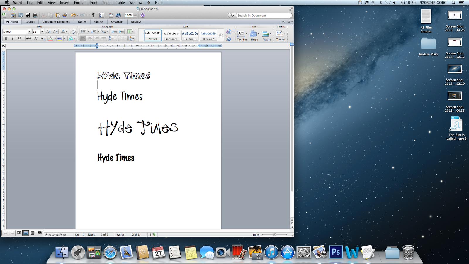
Here is an image of what I'm hoping my college magazine will look like, it had a mid shot of Alex quite large on the left hand side of the page, with a masthead in large, bold blue text saying hyde times, with the college logo on the top right hand corner.
-competitions
-top 5 must haves for college
-pupil of the week

Friday, 20 September 2013
research and Planning; Slutty Cheryl cole and Magazine Cheryl cole
In Image 1 Cheryl is wearing light pink clothing. The Top has lace on to show how feminine she is and the jacket has loads of gems and sparkles on to show the glamor. Therefore the audience would be women who are into glamour and fashion. Whereas in Image 2 Cheryl is in black leather top which is quite seductive.
In image 1 she has a blank facial expression but still looks innocent at the same time and innocent.
then in image 2 she has her tongue out licking a metal object seductively
 In Image 1 her hair is done very casual yet look like she's going to go out and her make up is simple yet looks like it has a lot of effort. In Image 2 she has very heavy black eye make up which has been smudged and bright red lipstick on which is a very seductive colour.
Image 2 is very seductive as there is water over her which is making her makeup run and while she's licking the metal object which could arouse certain members of the readers.
In image one she has both her hands her head holding parts of her hair up which makes her look even more innocent. then in image 2 her hand is up to her mouth holding the object.
Wednesday, 11 September 2013
Research and Planning; Front cover analysis

The masthead of the magazine is called 'company' and its done in Big bold text to draw attention to the magazine, also as its in pink it would attract girly girls who are into fashion. The main image is of a fashionable girl dressed for summer. there are a variety of slogans such as ' make up and party' which will be for girls who want a new look for when the go out instead of the same boring loo, also the other texts have a summer theme, feminine approach to stand out on the cream background/the girl so it will attract girls with to the magazine because of the style f the magazine suits their fashion sense.
Also each section of an article is done in a different front to demonstrate the variety if information inside which could be to highlight and attract different girls to the magazine,as it goes from make up tutorials in 'party invitation ' style to making money is a bold plain serious text.However, there is 'Ibiza' across the bottom on the magazine is a light pink colour, to show the how big of a vacation it would be and maybe symbolise the drinks they would get.
Tuesday, 10 September 2013
Research and Planning; In design tutorial
2. I then clicked the 'T' to create a text box across all 3 columns and wrote ' The Title' then changed the text size to 72
3. after that I clicked the 'T' again and made a text box in the 1st column and wrote a brief paragraph describing myself.
4. Next, i used the rectangle frame tool to upload a picture of Ed Sheeran onto my article then dragged him into the selected image area
Monday, 9 September 2013
Friday, 6 September 2013
Research and Planning; Photoshop challenge

2. Then I clicked on the 'T' symbol and wrote "AS media studdies" then highlighted the text and made it font size 24 in the 'century gothic' font
3.Thirdly, I changed the colour of the text by highlighting it and selecting the colour red at the side tool bar. Then dragged it into the centre of the page.
4. I made the background colour blue by going to the top tool bar, clicked layer, new fill layer then clicked solid colour
5. next I made the text have a shadow drop, I did this by going to layer, layer style then drop shadow the 4th down.
6. As I went to google to get the image of the man, then I clicked and dragged him onto my canvas and cut his background out by quick select tool and then deleted it.
7. Then I changed the colour of his hair by using the paint brush, selecting a colour off the right hand side tool bar and had the brush at size 9 and carefully went over his hair and beard in pink and purple
8. After, I went over his glasses and made them into sunglasses, I used the circle tool to create the shape of his glasses and made them blue
9. lastly, i used the rectangle tool to create a red border for my piece.
Research and Planning; skin tutorial

1. I opened photoshop and uploaded the image
2. I then applied the spot healing tool t remove her blemishes
3.then I changed her hair colour to a red/brown colour
4. After that I gave her Rosie Red checks by using the paintbrush tool, however I made it softer so it wasn't extremely obvious
5.I then used the painbrush tool again but made the brush hard to apply eyeliner, and reduced the size of the brush to 4 so it was realistic
6. I finished off by giving her red lips by again using the paint brush but on a size 6-10 size brush, then chose the colour white and reduced the brush size to 2 and coloured her teeth white
Research and Planning; CD cover

1. Firstly, I opened up an image of a CD, french horn and music sheet. Then went onto the cd layer and used the marquee tool which allowed us to select the cd, then used the mouse tool to drag the CD onto the music note background.
2. I made the CD smaller and placed it at the bottom left hand side and changed the colour of it to a light blue by clicking layer, layer style then colour overlay.
3. I clicked onto the French horn layer and did the same but used the quick selected tool due to it being a funny shape. After dragging it onto my music layer I changed the colour to a bras colour.
4. Next, I used the 'T' box to create a text box and wrote Jordan-Mary Goodall onto it and made the text larger and a different font
5. I then added music notes and placed the coming out of the Horn
6. Finally, I edited the background by going onto layer and trying different things and it the end I made mine into tiles, to be unique.
Thursday, 5 September 2013
Subscribe to:
Comments (Atom)